.png)
An interactive ecosystem designed to enhance learning outcomes and engagement with folklore
This project grew out of my experience teaching an undergraduate course on Mythology and Folklore at UT Austin. Working with students deepened my curiosity about how Augmented Reality could transform the way people encounter folklore. The research and design process documented here centers on one question: How might we help users engage with folklore through immersive experiences?
I worked as a UX Researcher & Designer, alongside Liz, Varsha and Vanessa.
Research phase:
• Surveys
• User interviews
• Competitive analysis
• User testing
• System Usability Scale
Design phase:
• Information Architecture
• Content design
• Visual design
• Wireframing
• Prototyping
Figma, Figjam, Photoshop, AutoCAD
Spring 2023 (10 weeks - February to April)
Since this project involved information architecture that needed to be tested for an exhibit, I employed the agile design methodology. This iterative process helped in seamlessly combining the multiple layers of my team's work(the content research, the application design and the 3D rendering of the space) crucial for the objectives set out during ideation.
.png)
Through competitor analysis, I identified common strengths, weaknesses, and unexplored opportunities for product features. This helped me synthesize industry standards and create a distinct brand identity for Art ImmHERsive.
I also identified overarching themes reflected across the exhibits. Art ImmHERsive's emphasis on cultural education emerged as its core strength, while its focus on global folklore made it memorable and enriched community engagement.

The screener survey revealed that the visitors of the exhibit may include people of any age and social or professional background. We uncovered 3 potential user groups: (1) Young professionals, (2) parents with children and (3) people above the age of 50. Due to time constraints, we decided to focus on young professionals and parents with children.


I conducted 9 interviews with respondents, with the following key findings that informed my design decisions:
Users prefer visual or readable information over digital maps for easier navigation. Moreover, senior citizens and kids may have the hardest time understanding maps. We must create print materials and let users trace their path on phones through a map that lets them check off things.
To maintain attention, we must alternate between text-heavy and audio-heavy stations, each lasting less than 15 minutes. It is requisite to eliminate wait times between segments and allow for skipping. Further research is needed to determine audio playback preferences, whether on loop or on command.
Kids and young adults are mostly drawn to spectacle and interactivity. People with kids are mostly concerned with the appropriateness of the content and if the experience will be engaging enough to keep their kids’ attention.
Participants valued the freedom of exploration, with 7 out of 9 expressing positive sentiments towards getting lost. However, they also emphasized the importance of easy navigation and essential facilities like food, bathrooms, and a directory.
The aggregated findings from the screener surveys and interviews revealed key frustrations. These pain points and needs were crucial in informing my design decisions later on.


By imagining our intended audiences, we adapted our product to suit how the physical space, the application and interpersonal would impact user experience.

Lorem ipsum dolor sit amet, consectetur adipiscing elit. Suspendisse varius enim in eros elementum tristique. Duis cursus, mi quis viverra ornare, eros dolor interdum nulla, ut commodo diam libero vitae erat. Aenean faucibus nibh et justo cursus id rutrum lorem imperdiet. Nunc ut sem vitae risus tristique posuere.

My conception of Art ImmHERsive was inspired by stories about strong women from all over the world. I start with A Thousand and One Nights, short stories that stretch across South Asia, China, and the Middle East, due to its distortion in popular culture.
The visuals and color composition were inspired by a spectrum of art styles. The vignettes were inspired by modernist and abstract art, line art, miniatures, geometrical patterns, and Mughal architecture. I also tried to honor the rich jewel tones that are hallmarks of Islamic art and architecture.
.png)

Due to the visual nature of the project, it was important to research multiple designs for our brand identity. I compiled themes, color palettes and guiding visuals for four themes: futurism, minimalism, historical and children's storybooks.

Lorem ipsum dolor sit amet, consectetur adipiscing elit. Suspendisse varius enim in eros elementum tristique. Duis cursus, mi quis viverra ornare, eros dolor interdum nulla, ut commodo diam libero vitae erat. Aenean faucibus nibh et justo cursus id rutrum lorem imperdiet. Nunc ut sem vitae risus tristique posuere.
For the physical space, I researched Islamic architecture to inform the aesthetic of our imagined physical space. Based on my content research, my team calculated the footfall of the Austin Public Library and sketched out rooms with various ways of organizing information. These sketches were later visualized through AutoCAD.
.png)
Lorem ipsum dolor sit amet, consectetur adipiscing elit. Suspendisse varius enim in eros elementum tristique. Duis cursus, mi quis viverra ornare, eros dolor interdum nulla, ut commodo diam libero vitae erat. Aenean faucibus nibh et justo cursus id rutrum lorem imperdiet. Nunc ut sem vitae risus tristique posuere.
Lorem ipsum dolor sit amet, consectetur adipiscing elit. Suspendisse varius enim in eros elementum tristique. Duis cursus, mi quis viverra ornare, eros dolor interdum nulla, ut commodo diam libero vitae erat. Aenean faucibus nibh et justo cursus id rutrum lorem imperdiet. Nunc ut sem vitae risus tristique posuere.
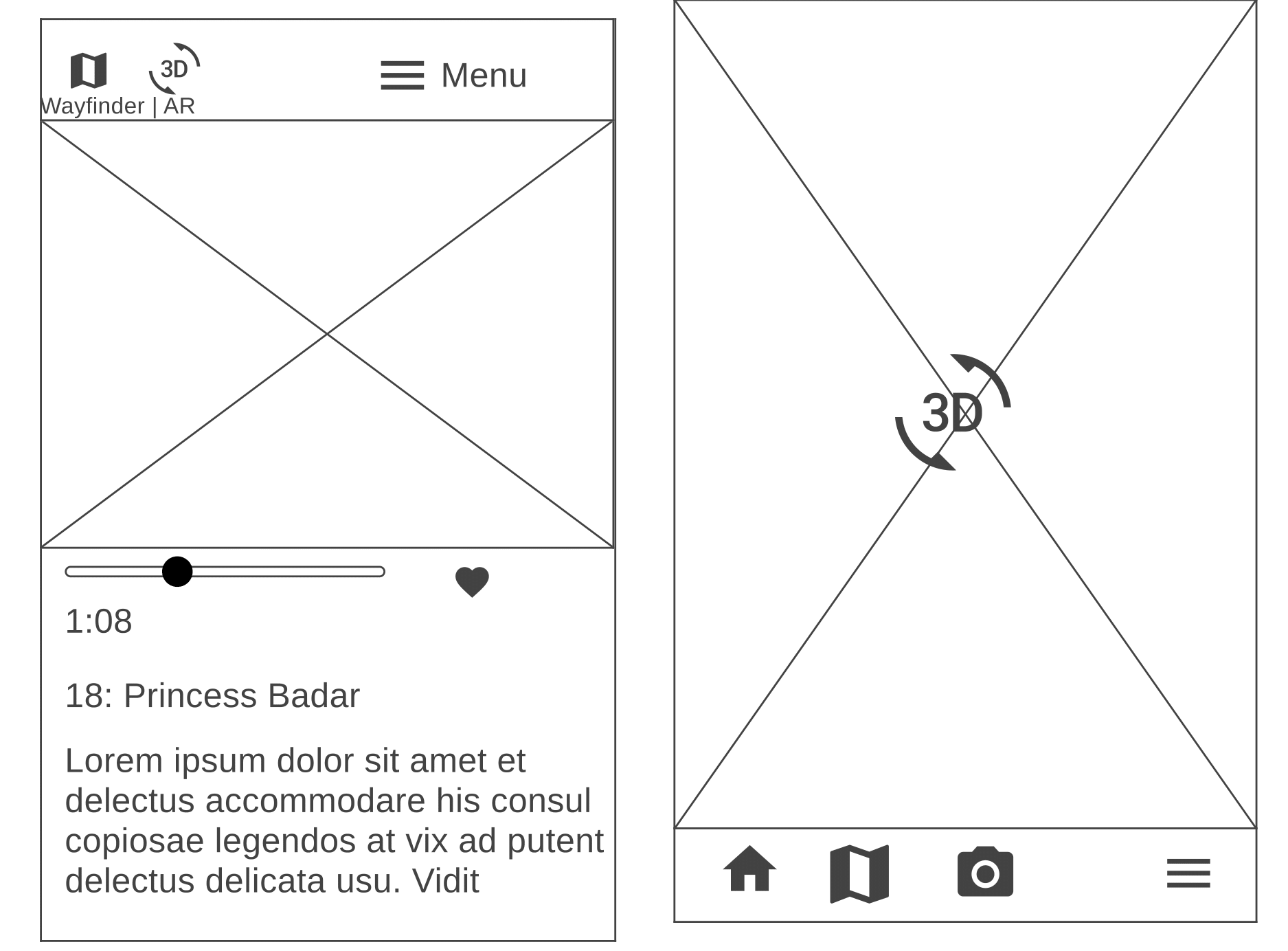
For the initial design, we conducted a quick Crazy 8's exercise as a team. This helped us align on key features for the mobile app, including a flow for learning about the exhibit, reserving tickets, accessing audio guides, using an AR camera, scanning QR codes, navigating with a wayfinder, and saving favorite parts of the exhibit.
.png)
While sketching, my goal was to give users quick, easy access to the app’s features during the exhibit, ensuring the design didn’t distract from the immersive experience. This led to a finalized layout featuring a bottom navigation bar with icons for key features. My tidied lo-fi wireframes are shown below.

.png)
Lorem ipsum dolor sit amet, consectetur adipiscing elit. Suspendisse varius enim in eros elementum tristique. Duis cursus, mi quis viverra ornare, eros dolor interdum nulla, ut commodo diam libero vitae erat. Aenean faucibus nibh et justo cursus id rutrum lorem imperdiet. Nunc ut sem vitae risus tristique posuere.
.gif)
I also mapped our information architecture to ensure that all flows were complete and would make sense to our users.
The proposed key tasks flows were as follows:
•Learn about Art ImmHERsive production house
• Find the exhibit of interest in your city
• Book your tickets
• Access the map and find something you want to see first
• Listen to the audio guide
• Learn about the AR game
• Open AR camera to see hidden story items
• Save a story item to your collection and learn more about the item
• Scan a QR code to quickly access a story’s page
• Find your collected story items

To iteratively test and improve the comprehensibility of our layered information architecture, we designed a list of quick tasks to assess whether users could quickly and easily navigate through main flows.
Task 1: Find the One Thousand and One Nights event you have scheduled a visit to see.
Task 2 : Listen to the audio version of Chapter 1 of the story.
Task 3: Collect the gold lamp’s AR token.
From this round of testing, I derived the following key takeaways:
From this round of testing, I derived the following key takeaways.
Nomenclature: The names of several pages confused users, e.g. Art, Explore, My Library - it was challenging for users to complete information-seeking tasks on the first pass when they were unsure what they would find on these pages.
Navigability: The hamburger menu needed to be workshopped to include, exclude, and reorder functions. Additionally, it was challenging for users to locate the Princess Badr exhibit because they weren’t sure where to navigate- e.g. Exhibits, My Events, My Master Library.
Core Functionality: Some users weren’t sure they grasped the main purpose of the app. An e-reader? A booking site? Additional information? The AR game? We decided to focus less on booking and e-reading, and more on providing additional information + the AR game.
On the basis of lo-fi feedback, we created an updated mid-fi Figma prototype:
We conducted mid-fi testing right after spring break to further develop our phone app and to understand user behaviors at in-person exhibits
Nomenclature: The names of several pages confused users, e.g. Art, Explore, My Library - it was challenging for users to complete information-seeking tasks on the first pass when they were unsure what they would find on these pages.
Navigability: The hamburger menu needed to be workshopped to include, exclude, and reorder functions. Additionally, it was challenging for users to locate the Princess Badr exhibit because they weren’t sure where to navigate- e.g. Exhibits, My Events, My Master Library.
Core Functionality: Some users weren’t sure they grasped the main purpose of the app. An e-reader? A booking site? Additional information? The AR game? We decided to focus less on booking and e-reading, and more on providing additional information + the AR game.
We set up our simulated environment in the PCL grad student lounge.

We produced a simplified information architecture for the hi-fi to emphasize key flows.
I overhauled the navigability of the app, added several micro-interactions, and implemented a design system in our hi-fi prototype. I led the content research, visual design and creating the flow for the AR game since I was relying on my training in literature and folklore for storytelling.
Block Quote
Block Quote
Lorem ipsum dolor sit amet, consectetur adipiscing elit. Suspendisse varius enim in eros elementum tristique. Duis cursus, mi quis viverra ornare, eros dolor interdum nulla, ut commodo diam libero vitae erat. Aenean faucibus nibh et justo cursus id rutrum lorem imperdiet. Nunc ut sem vitae risus tristique posuere.
For the final usability tests, I relied on the Wizard of Oz technique to simulate the 1,001 Nights exhibit by putting up themed decor, paintings and sign posts for directions in the physical space. After setting up the space, I conducted usability testing sessions with 7 participants. The task flows assessed were as follows:
Task 1 - Open the app and create an account. Then, find out if your friend/child will be able to access the physical space in her wheelchair.
Task 2 - Find the event collection 1,001 Nights and locate Exhibit 1: The Story of Princess Badr to save to your events.
Task 3 - Look for information on Princess Badr’s relationship to 1,001 Nights.
Task 4 - In the app, scan the QR code. Navigate to Chapter 4’s audio guide and favorite it for later.
Task 5 -Task: Find out how to play the AR game for this exhibit, and let me know when you think you understand.
Task 6 - Start playing the AR Game: open the cam to see what the magic keys will reveal to you. Also, save the token to your collection, then view the collection.
From this round of testing, I developed the following key takeaways:
Information architecture: Some users had challenges with locating Accessibility info and finding the audio guide that stemmed from the nesting of a specific exhibit’s information into the overall app (which supports many exhibits).
Comprehension: Some users did not quite understand the relationship between Princess Badr’s story and the overarching collection, One Thousand and One Nights.
AR game: Users pinpointed some minor issues with mechanics (e.g. capturing an AR token) and gave suggestions for the incentive structure we built into the game.
The seamless integration of exhibit and app design requires being cognizant of accessibility needs to avoid sensory issues.
Information architecture is crucial for designing complex experiences at all levels of content strategy, physical design and app design.
While designing for diverse audiences, it is important to provide adequate cultural context without creating information overload.
Post-testing, I administered a System Usability Scale (SUS) questionnaire to quantify the experience.
.png)
You can play my AR game by clicking on the prototype below or the link here.
.png)
Click play video to watch my team's rendition of the Thousand and One Arabian Nights.
 (1)-poster-00001.jpg)
The seamless integration of exhibit and app design requires being cognizant of accessibility needs to avoid sensory issues.
Information architecture is crucial for designing complex experiences at all levels of content strategy, physical design and app design.
While designing for diverse audiences, it is important to provide adequate cultural context without creating information overload.
.png)