.png)
Course: Human-Computer Interaction
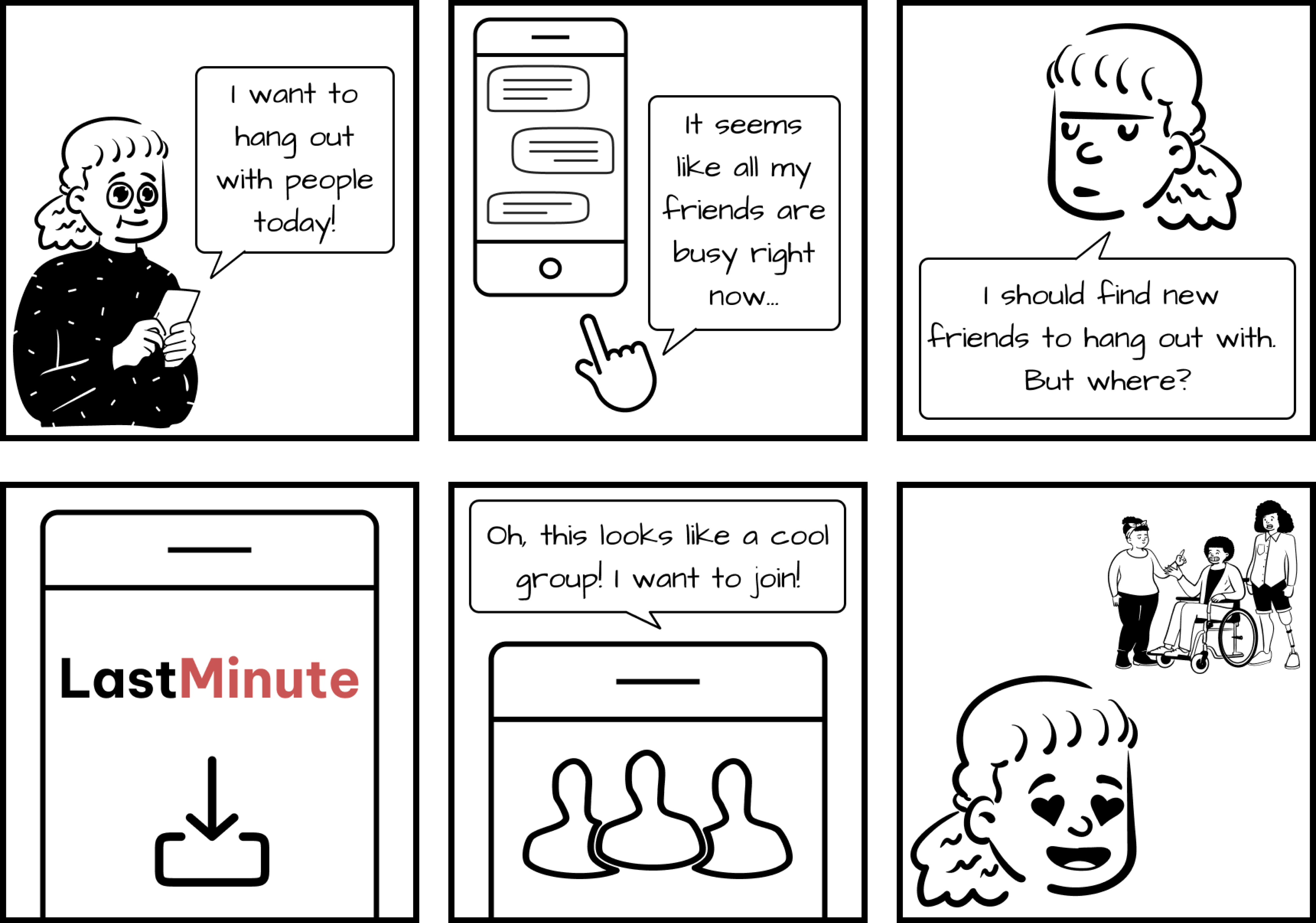
A platform for reselling & buying tickets for unforeseen plans
This app was inspired by my struggle to find tickets for a Cigarettes After Sex concert for my friend's birthday gift last year. I was scrambling to find people who couldn't attend the concert for some reason and wanted to get rid of their tickets. I also couldn't verify which people were credible and had to base my hefty purchase mostly on conjecture.
This experience made me realize the need for an app that aggregates tickets being resold in one place to facilitate variety and price comparison for last-minute people with last-minute plans.
I worked as a UX Designer, UX Researcher, and Information Architect alongside Asma, Nakyoung, Madhav and Aliana.
Research phase:
• User interviews
• Personas
• Storyboards
• Hierarchical task analysis
Design phase:
• Information architecture
• Iterative wireframing and prototyping
• UX writing
Figma, Figjam, Mural, Draw.io
Spring 2023 (10 weeks - February to April)
Since we were creating a product from scratch, we benefited from using the double diamond approach and the Agile process. This methodology helped us iteratively conduct in-depth ideation, design and evaluation so that the application remains in line with Last Minute's value proposition.
We were able to produce the main functionalities and a smooth user experience in line with our vision of providing a convenient way of booking tickets last minute and encouraging connections amongst people with similar interests.
In order to book your own last minute tickets, you can play with our prototype below:


I identified and conducted analysis of competitor platforms that help users purchase and sell tickets to find gaps, pain points and opportunities that we could leverage to distinguish Last Minute.
People experienced the inability to verify tickets and buyers and compare prices due to the scattered and unregulated nature of the problem space.
While applications that sold tickets supplied by official channels ranked available deals, aggregated tickets from various sources and provided customizable search filters, there was lack of transparency about pricing after taxation and service fees. I also found that users were given few options to customize experiences while making ticket purchase.
Lastly, there was an opportunity for a community component and encourage socialization on Last Minute. The exact details of this community component were to be figured out later on.

We conducted interviews to understand the needs and usage behaviors of people looking to buy and sell tickets to further our aim of meeting unfulfilled needs.
I interviewed 3 out of 11 users aged from 22 to 49 years with a mix of gender identities and professional backgrounds.
I sought people who had experience with buying or selling last-minute tickets to various types of events, such as concerts, sports games, theater shows, and other live entertainment events.
I also created a list of questions to ensure consistency in the collected data. Some of the important questions asked were as follows:
• What type of events do you like to attend?
• How do you find events?
• Tell me about the last spontaneous event you went to.
• What do you consider to be “last-minute”?
•Tell me about the last time you bought a last-minute ticket.
• Tell me about the last time you sold a ticket.
• How much are you willing to pay for a last-minute ticket? Why?
• How many times have you met new people through last-minute plans?
• How do you verify people’s identities when making event transactions online?
• How would you change your overall experience with last-minute events?
• How would you change your overall experience with selling tickets last minute?
Using the interview findings, we created an affinity diagram to understand common themes and problems. We began with high-level groups, then categorized smaller sub-sections of each group, adding depth to the motivations behind our participant’s actions and opinions.

"It's hard to compare prices while buying tickets that are being resold and I always wonder if I'm getting the best deal."
"I use PayPal for chargebacks on tickets from sources that could be fake."
"Buying tickets shouldn't incorporate high service fees. Platforms should be clear about pricing from the start."
"I'd love an easy-to-use platform for people who aren't that tech-savvy. It'd be cool to get some help with verification."
We also created storyboards to start ideating how would interact with the Last Minute app from the perspectives of three user profiles: buyers, sellers and people lookig for communities with shared interests.


By aggregating the demographic information and recurring motivations, goals and frustrations, the team created two personas to reference for design decisions.
Anna Sri is a master’s student at the University of Texas. She just moved to the city and has already found a group of friends. As a critical thinker, she is skeptical of websites using her data. She is also frustrated with websites collecting selling fees, and wishes she could cut out the middleman. Anna is tech-savvy when it comes to technology, as she finds most of her desired events on social media.
%201%20(1).png)
Steve Do is a 32-year-old marketing executive from San Francisco. He is always on the lookout for the next big concert or show to attend. Steve's busy work schedule often leaves him with little time to plan his social life, but he always manages to find time for music. Despite his best efforts, Steve sometimes finds himself unable to attend concerts he has already bought tickets for. He needs an app that will allow him to sell his tickets quickly, easily, and securely to avoid losing money.
.png)
I created the information architecture, which was consistently updated until the final prototype to ensure that all the flows provided a flawless user experience and identify areas that needed improvement.
For instance, I realized that the prototype doesn't allow to skip the onboarding process and see available events without it, so I corrected it in the prototype. The IA also helped me figure out the one-click switch that connected the user flows from buyers and sellers' perspectives in the same account.

After deciding the main user flows as a team, I created low fidelity wireframes for the screens related to onboarding, ticket buying and selling and user profile. The main research questions guiding my design processes were as follows:


I created a design system using the golden ratio to ensure appropriate focus and information hierarchy through the app design.
The onboarding flow allows users to create a profile after a quick identity verification process that asks them for their phone number and photo taken through the camera app, an idea inspired by Bumble's verification process.
Afterwards, users can select the types of events they are interested in through a radio menu and move to the home screen, with a search bar with VUI, filters for customized search results, profile featur, and a button to switch between the buyer and seller flow.

Allows users to see the app's main features and helps them quickly create and account
Curates events by using voice input, keywords or filters related to interests, time/ date, price, location and distance
Users can see their purchase history by clicking the Tickets tab on the navigation bar.
Clicking on a ticket also reveals directions to the event.
The high fidelity prototype was tested with 2 participants to gain user feedback. After the participants were briefed about the purpose of the app, they were told that they would be evaluating it as potential sellers of a concert ticket that they couldn’t attend.
Task 1: Create a profile.
Task 2: Sell a ticket .
Task 3: Find a community to join.
Finding: Many users struggle with creating a strong password that is difficult to guess or crack.
Change: I added suggestions for setting a strong password that includes a combination of uppercase and lowercase letters, numbers, and special characters. These suggestions are in line with the best cybersecurity practices provided by the Cybersecurity and Infrastructure Security Agency (CISA).
Finding: “Forgot Password” SectionFindings: We did not have an option to retrieve passwords if the user forgot.
Change: I have added a “forgot password” to the sign-in screen to provide users with a convenient and secure way to regain access to their account in case they forget their password. This will also help to reduce relevant support requests.
Finding: Users would like a preview to the app before making the commitment to sign up.
Change: This option was added to provide more flexibility as users may not be interested in events at the time of sign-up or may to browse events later.
Allowing users to change between the seller and buyer flows through a switch helped simplify the information architecture.
Friendly warnings and concrete instructions are central to assist users in recovering from errors related sign-up and payment flows.
It is crucial for good design to respect users' time and freedom to choose if and how they want to interact with the application.
.png)
